You may have composed an email invite for an event or two in your time.
But have you ever wondered what elements of an email invite compel people to convert?
In this post, we’ve pulled a few invite emails taken from our email marketing templates library and analyzed them for conversion.
We’ve outlined what they did well and offered some advice on how they could be improved, with the goal of giving you some ideas you can apply to your next event invite email to increase ticket sales and attendance.
1. Big Sea Breakfast Club
What they did well
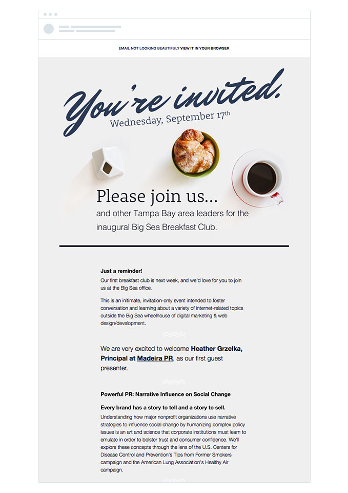
- Design & imagery – The design of the email is pleasant and inviting. The font and imagery at the top of email are inviting, and compel the reader to continue reading the rest of the email for more information.
- Opening Copy – The use of the words ‘and other Tampa Bay area leaders’ is a nice touch. Assuming this email only went to businesses in the Tampa Bay area, it addresses the reader directly and lets them know this event is highly relevant to them.
- Invite-only event – The invite-only nature of the event creates a sense of exclusivity around it and compels people to attend and see what sort of exclusive insights and education they can get that will help them stand out above their competitors.
- Map – The inclusion of the nicely-designed map at the bottom of the email helps people understand where the event is, and saves them from having to do the mental calculations around how long it will take to get there and how long it will take them to get back to work after the event.
Suggestions for A/B Testing
- Improve email structure – Although they have separated the header area from the rest of the email, the body copy is quite a large text block and can be quite overwhelming. Given that most people will only scan your email campaigns, it would be worth breaking the email up into several smaller sections that address who the speaker is, what she will be discussing, the timetable of the event and the breakfast options being offered. This will enable people to better digest these different bits of information and get excited about what’s on offer.
- Tell reader’s more about the speaker – The organizer has lined up a great speaker who is an expert in the field of PR, however, they haven’t done much to tell readers that. It would be worth including a bit more information about the speaker and her accomplishments to help establish her credibility and trust. Outlining clients she has worked with and results she has achieved will increase people’s desire for the knowledge and information she possesses and increase the chances they will attend the event.
- Include a prominent call to action – The call to action in this email is a small text link to reply to the organizer and RSVP. It would be worth testing including a more prominent call to action button in the email, and linking it through to an event landing page. Tools like Eventbrite and Unbounce make this easy to setup, and doing so makes it easier for people to RSVP to the event and increases their chances of attending.
2. Working Three
What they did well
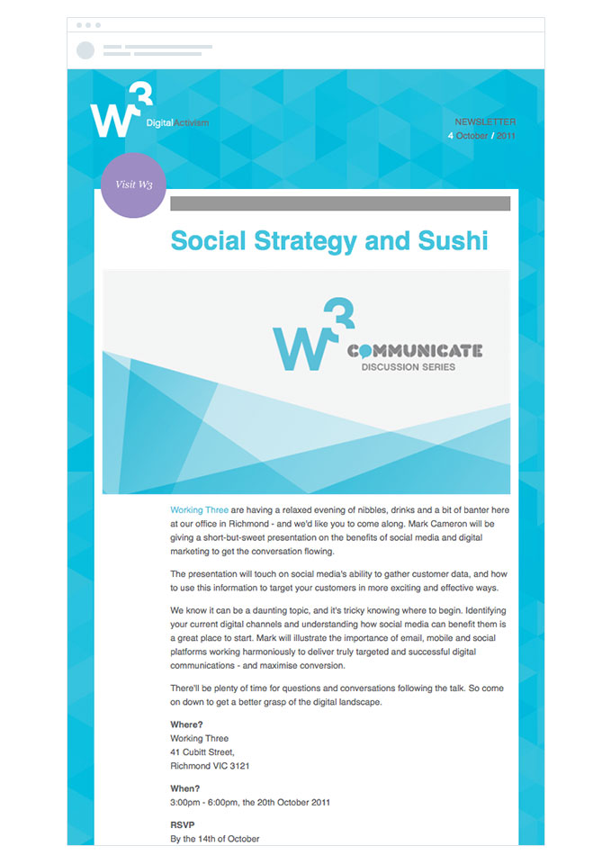
- Nice Design – The design of the campaign is visually appealing and instills a sense of trust and authority in the event organizer. This helps ensure people that the information they get from the event will be authoritative and useful, and increases their desire to attend.
- Series Banner – The use of the banner informs readers that this ‘Discussion Series’ is something that has been going on for some time. This instills authority in the event and relieves anxiety the reader may have around the value they will get from attending.
Suggestions for A/B Testing
- Improve the value proposition – As you can see from the screenshot, the primary value proposition of this email is ‘Social Strategy and Sushi’. While this is a somewhat punchy headline, it isn’t clear what the reader is going to get from the event and why they should attend. It would be worth rewriting the value proposition to incorporate the 3 key elements of an effective value proposition, and testing to see if the revised value proposition compels people to take action.
- Add a testimonial to the email – Given that this event is part of a larger series, it could be worth displaying a testimonial from someone who has attended a previous event. This will help alleviate reader’s fears that the event won’t be valuable and encourage them to attend.
- Include a more prominent call to action – Like the previous email, the call to action in this email is a small text link to reply to the organizer via email. By making this call to action a button that leads to a landing page, it makes it much easier for people to respond to the invite and will help increase attendance on the day.
- Remove Twitter & Facebook buttons – The Twitter & Facebook buttons at the bottom of the email are potentially distracting people from the core action W3 wants people to take, which is responding and attending the event. It could be worth removing those to reduce distractions and keep people focused on the main conversion action.
Get our guide to Designing High-Performing Email Campaigns and make every email you send a success.
3. Hidden Dinner
What they did well
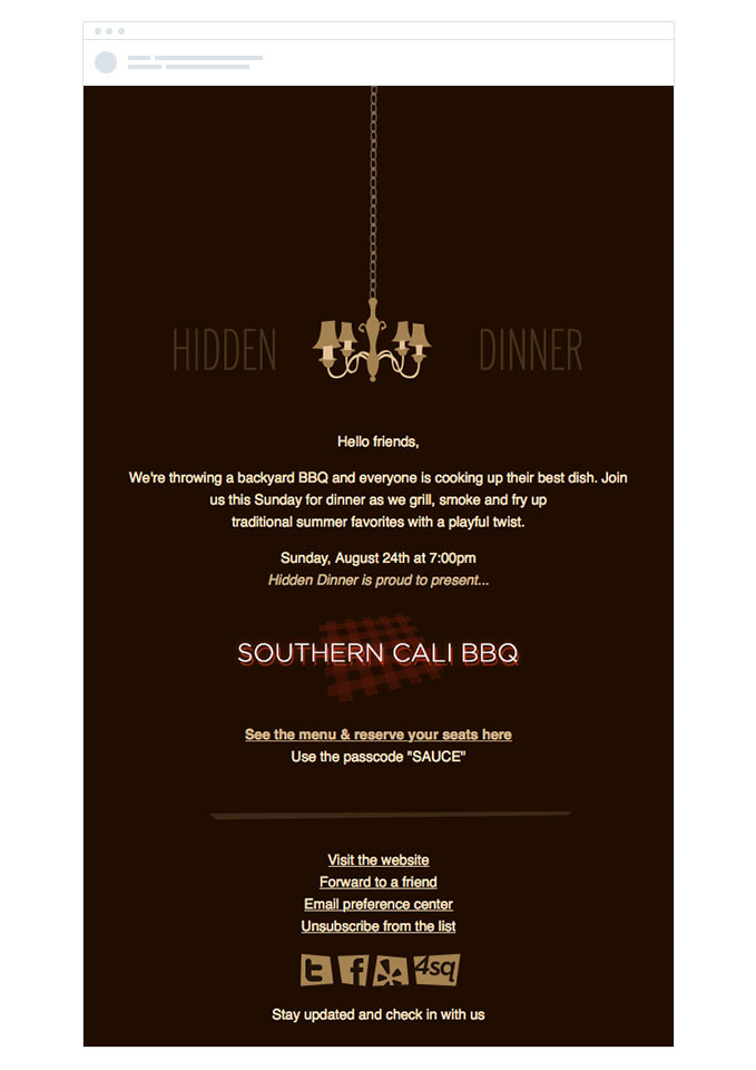
- Unique, on brand design – The design of the email is unique and perfectly in line with their website and larger brand. This creates a cohesive experience for customers that continues to build loyalty for their brand.
- Great use of curiosity – You’ll notice that this email contains a lot less information about the event than the others featured on this list. Hidden Dinner create a sense of curiosity by holding back information on the menu, entertainment, etc. that compels readers to click on the ‘See the menu and & reserve your seats’ link to learn more. While this is a great play by Hidden Dinner, be careful about using it in your own campaigns. Hidden Dinner have built a great brand and are only sending this to people who know how great their events are, so it works for them. However, if the people on your list aren’t familiar with your events then you’ll need to ‘sell’ the event more by including information on food, entertainment, speakers, etc.
- Great CTA microcopy – The call to action copy they use in the email is great. ‘See the menu and reserve your seats’ is highly descriptive and leaves the reader with no doubt what is going to happen when they click it.
- Great RSVP flow – Clicking on the call to action link at the bottom of the email takes readers to a branded landing page. Once they enter the password, they can see the menu and reserve seats for the event. This frictionless flow allows people to respond and book their tickets with ease, and helps increase ticket sales and event attendance.
Suggestions for A/B Testing
- Add a prominent value proposition – The beginning of the email features their logo beautifully, but then just dives straight into the body copy. Although the copy is tight, the email should include a prominent value proposition that defines the offer and the benefits for the reader, such as ‘Enjoy a Southern Cali BBQ under the stars’. This catches people’s attention and compels them to continue reading the rest of the email to learn more.
- Test adding a testimonial to the email – Hidden Dinner is a recurring event that has occurred several times before, so it would be worth including a testimonial from someone who has attended a previous event. This will help reassure readers it’s an enjoyable evening and worth their time attending.
- Include a more prominent call to action – Although well written, the call to action in this email is a still a small text link hidden at the bottom of the email. By making this call to action a button with a contrasting color, it becomes more obvious to people who are scanning your campaigns what the next step is, and encourages more people to take it.
4. Steadfast Creative
What they did well
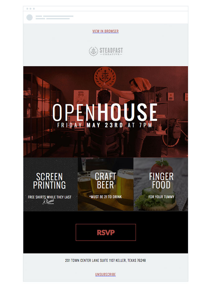
- Beautiful design & imagery – The email itself is beautifully designed. The animation behind the header image is clever and the use of beautiful imagery behind each square makes this email really impressive. Each one of those images links through to their RSVP page as well, which helps to increase conversions.
- Big call to action button – The use of the large call to action button at the bottom of the email is great, and makes it clear to readers exactly what the next step is.
- Great RSVP flow – The CTA button and images link through to a simple RSVP form hosted on their website, making it easy for people to RSVP to the event.
Suggestions for A/B Testing
- Add a value proposition – The current value proposition of this email is ‘Open House, Friday May 3rd at 7pm’. Whilst this does a good job of telling me when the event is, I’m not yet sold enough on attending the event to need to know when it is. Adding a value proposition that succinctly outlines what the event is about and what the benefit of attending is could help in grab the reader’s attention, get them to read the rest of the email and convince them to convert.
- More event details – Although the email is beautifully designed, it lacks a lot of detail about the event itself. What happens at the event? Who am I going to meet? Is there a speaker or some sort of entertainment? As a reader, I’m left with a lot of questions about the event, and that would prevent me from committing to attend. Unless this is a regular occurrence and everybody on the list knows what the event is, it could be beneficial to include more content that spells out to the reader the schedule for the evening and the benefits they will get for attending.
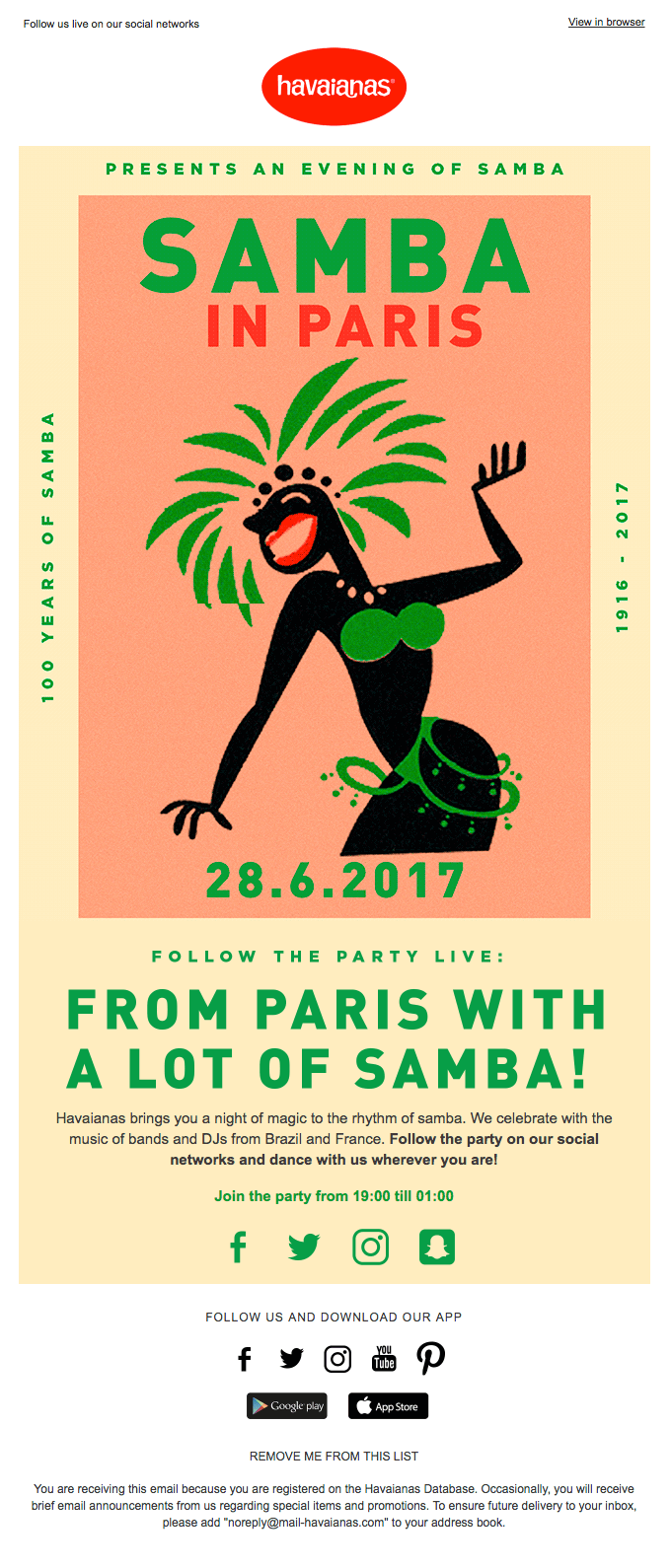
5. Havaianas
Image: Really Good Emails
What they did well
- This event invitation nods to event posters—We imagine this branding is used across all mediums (At least, we hope so!).
- It speaks to a specific location and culture and the color palette is completely welcoming. We can tell this is going to be an experience to remember, just from the artwork alone!
Suggestions for A/B Testing
- Try out different variations or placement of this artwork. Are people more likely to click when they see the image first or when it’s placed after copy about the event?
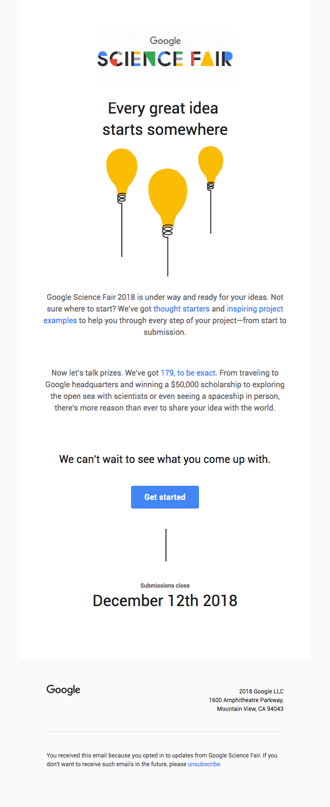
6. Google Science Fair
Image: Really Good Emails
What they did well
- The organization and cleanliness of this email is pristine, speaking to science lovers everywhere.
- It stays on-brand with everything Google. You don’t have to reinvent the wheel just because you’re introducing a new event.
Suggestions for A/B Testing
- Add more or less information about the conference sessions and see how subscribers respond.
7. Meetup
Image: Really Good Emails
What they did well
- This is a great example of a multi-event invitation. It cuts each event down to the important details: Logistics and call-to-action.
Suggestions for A/B Testing
- Try different colors for the CTA buttons.
- Experiment with more or fewer event listings.
8. BVE
Image: Really Good Emails
What they did well
- Speaker features—It’s always helpful to put a face with a name!
- Use of color to organize copy and information.
Suggestions for A/B Testing
- Try various speaker line-ups and order of copy.
- Send to various segments based on geographic location.
9. Stylist Live
Image: Really Good Emails
What they did well
- Fun pops of color that maintains visual interest throughout the email
Suggestions for A/B Testing
- Try different color palettes or an email with fewer visuals and more text and vice versa.
What you can learn from these emails
Across these 9 event invite emails, we’ve seen a number of things done well and a number of areas for improvement. Here are the common themes that you can learn from to help increase the conversion rate of your next event invite campaign:
- Make it beautiful – All of the event invite emails seen here are well-designed and feature nice imagery and compelling visuals. This attention to detail reflects positively on your event and gives people confidence that it is going to be well run, informative and ultimately worth attending.
- Have a clear value proposition – Make sure you start your event invite campaign with a succinct value proposition that makes it clear to the reader what is going to happen at the event and what benefit they will get from attending. By doing so, you catch the reader’s attention and draw them in to learn more about the event and ultimately convert into an attendee.
- Sell the event – Even if your event is free, people are still paying with their time and you need to sell the event just like you would a product. Include detail about what will happen at the event and the benefits they will get from attending to compel people to attend.
- Structure your email for scanners – People receive an average of 121 emails per day, and they don’t have time to read each one word for word. Instead, they scan your email campaigns looking for parts that interest them. So instead of writing a big, daunting block of body text to get all the information across, considering breaking it down into various sections with supporting images and visuals. This makes it much easier for people to scan your email and will result in more people receiving the key message of your campaign and taking action.
- Use a call to action button – When we tested using a button vs. a text link as a call to action in our own email campaigns, we got a 28% increase in conversions. Buttons help your call to action stand out above the rest of the content in your email, making it clear to readers what the next step is and compelling them to take your desired conversion action.
- Think about the entire flow – There are many steps between sending your event invite and people walking in the front door, which means there are plenty of opportunities for people to drop off. By creating a simple, effective RSVP flow like Hidden Dinner and Steadfast Creative have done, you can get more RSVP’s for your event and ultimately more attendees on the day.
Start creating your own event email from a free email template here.
Wrap Up
Event invite campaigns are an incredibly important part of your event promotion and planning. They are a great way to get the word out about your event to customers, leads & contacts and can help drive ticket sales and get attendees through the door.
So take these tips on creating a great event invite email, apply them to your next campaign and let us know how it goes!
