Individual Movement Strategies Revealed through Novel Clustering of Emergent Movement Patterns
- PMID: 28272429
- PMCID: PMC5341027
- DOI: 10.1038/srep44052
Individual Movement Strategies Revealed through Novel Clustering of Emergent Movement Patterns
Abstract
Understanding movement is critical in several disciplines but analysis methods often neglect key information by adopting each location as sampling unit, rather than each individual. We introduce a novel statistical method that, by focusing on individuals, enables better identification of temporal dynamics of connectivity, traits of individuals that explain emergent movement patterns, and sites that play a critical role in connecting subpopulations. We apply this method to two examples that span movement networks that vary considerably in size and questions: movements of an endangered raptor, the snail kite (Rostrhamus sociabilis plumbeus), and human movement in Florida inferred from Twitter. For snail kites, our method reveals substantial differences in movement strategies for different bird cohorts and temporal changes in connectivity driven by the invasion of an exotic food resource, illustrating the challenge of identifying critical connectivity sites for conservation in the presence of global change. For human movement, our method is able to reliably determine the origin of Florida visitors and identify distinct movement patterns within Florida for visitors from different places, providing near real-time information on the spatial and temporal patterns of tourists. These results emphasize the need to integrate individual variation to generate new insights when modeling movement data.
Conflict of interest statement
The authors declare no competing financial interests.
Figures


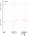
 . Circle sizes scale with the number of individuals in each group. Significant differences between time periods are shown in black (non-invaded sites) and red (invaded sites) while non-significant differences are shown in grey (non-invaded sites) and pink (invaded sites). Differences for which the 95% credible interval did not include 0 were deemed statistically significant.

 ). Darker lines indicate links from groups with more individuals. Right panels: Visitation rate for the 10 largest groups (y-axis) is shown for a subset of Florida counties. Only counties that were visited 2% of the times by more than one group are shown. Red boxes highlight the counties with the four largest international airports in Florida, as determined by passenger boarding in 2013. Maps were created in R (version 3.3.1) and base map comes from the freely available database in the “maps” package in R (version 3.1.1).
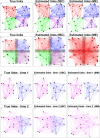
 ). Darker lines indicate links from groups with more individuals. Maps were created in R (version 3.3.1) and base map comes from the freely available database in the “maps” package in R (version 3.1.1).
Similar articles
-
Consistent scaling of population structure across landscapes despite intraspecific variation in movement and connectivity.J Anim Ecol. 2016 Nov;85(6):1563-1573. doi: 10.1111/1365-2656.12571. Epub 2016 Aug 15. J Anim Ecol. 2016. PMID: 27392248
-
Experimental Test of Preferences for an Invasive Prey by an Endangered Predator: Implications for Conservation.PLoS One. 2016 Nov 9;11(11):e0165427. doi: 10.1371/journal.pone.0165427. eCollection 2016. PLoS One. 2016. PMID: 27829031 Free PMC article.
-
ALTERNATE FOOD-CHAIN TRANSFER OF THE TOXIN LINKED TO AVIAN VACUOLAR MYELINOPATHY AND IMPLICATIONS FOR THE ENDANGERED FLORIDA SNAIL KITE (ROSTRHAMUS SOCIABILIS).J Wildl Dis. 2016 Apr 28;52(2):335-44. doi: 10.7589/2015-03-061. Epub 2016 Mar 16. J Wildl Dis. 2016. PMID: 26981686 Clinical Trial.
-
Counteracting effects of a non-native prey on the demography of a native predator culminate in positive population growth.Ecol Appl. 2016 Oct;26(7):1952-1968. doi: 10.1890/15-1020.1. Epub 2016 Sep 2. Ecol Appl. 2016. PMID: 27755742
-
Larval dispersal and movement patterns of coral reef fishes, and implications for marine reserve network design.Biol Rev Camb Philos Soc. 2015 Nov;90(4):1215-47. doi: 10.1111/brv.12155. Epub 2014 Nov 25. Biol Rev Camb Philos Soc. 2015. PMID: 25423947 Review.
Cited by
-
Extending the Latent Dirichlet Allocation model to presence/absence data: A case study on North American breeding birds and biogeographical shifts expected from climate change.Glob Chang Biol. 2018 Nov;24(11):5560-5572. doi: 10.1111/gcb.14412. Epub 2018 Aug 26. Glob Chang Biol. 2018. PMID: 30058746 Free PMC article.
-
Foray movements are common and vary with natal habitat for a highly mobile bird.Ecol Evol. 2024 Feb 29;14(3):e11096. doi: 10.1002/ece3.11096. eCollection 2024 Mar. Ecol Evol. 2024. PMID: 38435011 Free PMC article.
References
-
- Eagle N. & Pentland A. Reality mining: sensing complex social systems. Pers Ubiquit Comput 10, 255–268 (2006).
-
- Guo D. Visual analytics of spatial interaction patterns for pandemic decision support. Int J Geogr Inf Sci 21, 859–877 (2007).
Publication types
MeSH terms
LinkOut - more resources
Full Text Sources
Other Literature Sources
Research Materials

